Modal Dialog
Structure
Section titled “Structure”A modal dialog consists of:
- Header: Title (purpose of the dialog)
- Body: Content (text, forms, UI)
- Footer: Actions (primary, secondary, tertiary)
Behavior
Section titled “Behavior”- The background is completely disabled (overlay)
- Clicking outside the dialog does nothing
- On small screens → fullscreen
- No horizontal scrollbars
Best Practices
Section titled “Best Practices”Header
Section titled “Header”- Left-aligned title
- Title as an action or noun (Create new folder / Neuen Ordner anlegen, User administration / Benutzerverwaltung)
- Title is always an H1 element
- Sentence case (capitalize only the first letter)
- Give the dialog the
role="dialog"attribute - Close button (✕) in the top right corner (if the action can be canceled)
- Subtitles
- Buttons/actions in the header, except in rare cases (then as icon buttons to the left of the close button)
- No H1 element
- Give context or clear instructions (introductory sentence)
- Clear, direct instructions or an easy-to-understand question
- Only the body scrolls on vertical overflow
- Responsive design
- Absolute positioning
- Horizontal scrolling
Footer
Section titled “Footer”- Button hierarchy:
- Primary → filled, far right
- Secondary → outline
- Tertiary → text link
- Right-aligned, ordered from right to left
- Use explicit verbs, e.g.,:
- Confirm / Bestätigen
- Cancel / Abbrechen
- Critical actions:
- Confirmation by typing (e.g., a string)
- Only for high risk (data loss)
- Overflow (alternative: icon buttons)
- More than 3 actions
- Title: Infinitive form or configuration noun (Create new folder / Neuen Ordner anlegen, User administration / Benutzerverwaltung) → the dialog repeats the action from the action button or menu item
- Capitalize only the first letter of the title string (sentence case)
- Content: Clear, direct instruction or question, inform about consequences of the action
- Buttons: Use explicit verbs for the confirming action and Abbrechen/Cancel for the canceling action. Do not use Yes and No.
Example Dialog
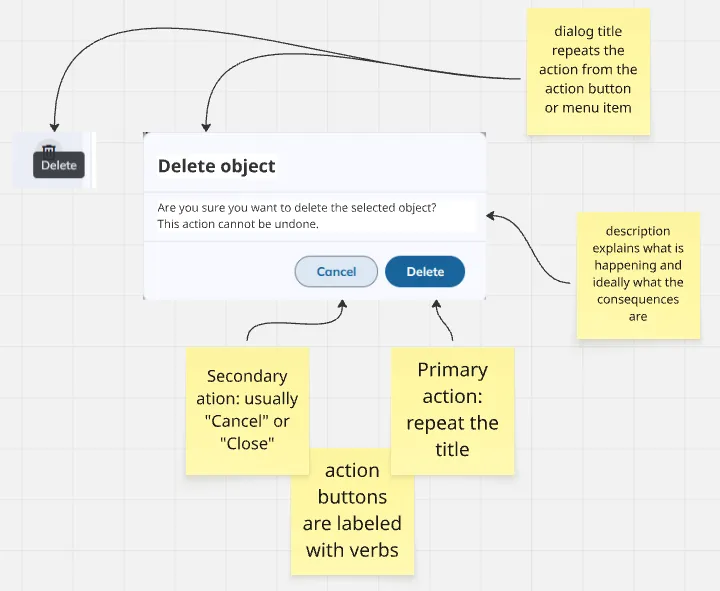
For more rules on UI texts, see Language.
Accessibility
Section titled “Accessibility”- Dialogs never open automatically
- Focus stays inside the dialog during keyboard navigation (focus trap)
- Tab navigation cycles within the dialog
- Esc closes the dialog (if the action can be canceled)
- After closing the dialog, return focus to the triggering element
- Reference: ARIA Authoring Practices Guide – Dialog (Modal)